Three reports to try in Trello
You don’t just have to look at your Trello boards to get information. Here are three other tools you can use to get a high-level view of your Trello tasks and team members.
We love Trello for its simplicity and easy, at-a-glance Kanban layout. But sometimes you want to dig a little deeper! Reporting can help you comb through your data, get meaningful insights about how your team is using Trello, and use that information to improve your workflow.
Whether you’re in sales, support or reservations, here are three ways to get the most out of reporting in Trello. Let’s create some reports!
Track the value of your sales deals
If your sales team is working in Trello with the Email for Trello Power-Up, you already have an overview of your CRM deal pipeline alongside all email communications. Each Trello list represents a stage in your deal pipeline, and each email card represents a customer or deal moving through your sales funnel. Your team members can easily share the workload and collaborate on email directly in Trello.
But what if you want to answer specific questions about your sales workflow like ‘How long does it take to close a deal?’ or ‘What’s the value of the deals in our pipeline right now?’ This information isn’t always immediately obvious and doing the analysis yourself can be time-consuming.
Reports by Blue Cat is a useful Trello Power-Up that can help you answer just these kinds of questions! Let’s take a closer look.
In this example, your sales team is using email to reach out to potential leads. You want to keep tabs on the value of the deal, so you set up a custom field to record the current sales value on every card.
Create a new custom field with the type ‘Number’ and give it a name that makes sense for your workflow. If you choose ‘Show field on front of card’, you will see the value of your custom field on the cards in your lists, as shown.
You’d like to be able to view the total value of sales in the pipeline, as well as the value of sales at each stage of the deal. No problem! Blue Cat Reports allow you to set up in-depth reports on custom metrics that you can generate at the click of a button.
To get an overview of the value of sales in each of your lists – as well as an overall total – set up a new report, then add a chart for each list you’d like to track. In our example above, we are tracking the total sales value, as well as the value of each stage in the pipeline: ‘Meeting’, ‘Prospects’ and ‘Closed’.
This is just a very simple example of the kind of reporting and analytics Blue Cat offers. You can work with checklists, due dates, charts and more to bring your data to life in ways that make sense for your team.
Keep on top of your help tickets
With Email for Trello, you can leverage the power of Trello for an email help desk. Incoming emails arrive as new cards and your support team can reply from within Trello. This in itself is a great way to visualize your support tickets – simply watch cards move between lists and quickly spot any bottlenecks as they arise.
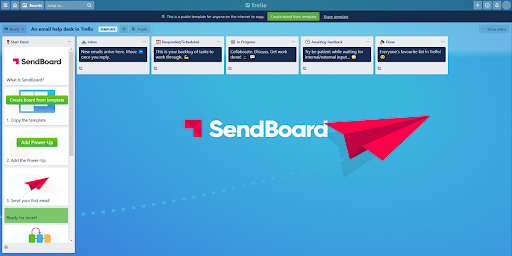
Create an email help desk in Trello
This Trello template uses SendBoard to connect a shared email address to a Trello board. You’ll be able to receive and reply to emails without ever leaving Trello.
But what if you’re looking for more? Perhaps your team deals with a lot of similar tickets and you’d like to track how often the same queries come up. Dashcards is a great Power-Up for managing this kind of reporting in Trello.
Let’s look at an example. Your support team would like to track instances of their two most common help queries: password reset requests and bug reports. First, the team assigns a label to each issue and appends the label to the relevant cards.
The team uses the purple label for password requests and the blue label for bug reports.
Now all that’s left to do is track it in Dashcards! The team adds a tracking lane and sets up two new Dashcards – one to count purple labels (password reset requests) and one to count blue labels (bug reports). This kind of reporting is particularly useful for large boards with lots of cards!
Dashcards are just like any other Trello card, so you can arrange them on your boards to keep the metrics you are tracking front and center.
Although less powerful than Blue Cat Reports, Dashcards provide some neat reporting right on your Trello board. You can also customize the background image of your dashcards to keep things visual. Here’s an example where we use Dashcards to sum up the value of deals in a sales pipeline.
Dashcard features
Although less powerful than Blue Cat Reports, Dashcards provide some neat reporting right on your Trello board. You can also customize the background image of your dashcards to keep things visual.
Here’s an example where we use Dashcards to sum up the value of deals in a sales pipeline. You could add a Dashcard like this to the top of each list.
Manage your team’s workload
Casting your eye across your boards for who’s working on what is quick and easy, but sometimes you need more granular data about your team’s capacity. If you’re on a paid Trello plan, the Dashboard view is an invaluable tool for team management. The Dashboard view in Trello can help you answer questions like ‘What is everyone working on?’, ‘What stage are their projects at?’ or ‘Who has availability right now?’
In this example, the Pet Cuts team is using Email for Trello to manage their salon bookings. Each list represents a stage of work right through from booking request to appointment completion. New emails arrive as cards on the ‘Inbox’ list, meaning the whole team can get involved in responding to messages, assigning tasks and collaborating on to-dos.
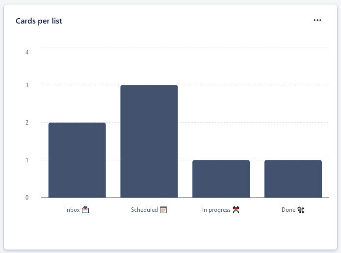
By switching to the Dashboard view in the top left dropdown menu, here are just some of the charts the Pet Cuts team can use to get more detail about their team’s workflow.
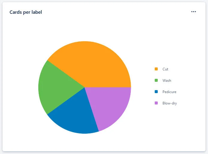
Pie chart of cards per label. By using labels for each type of booking, the team can see what treatments are most popular at the Pet Cuts salon right now.
Stay on track with Trello reports
Whether you’re using additional Power-Ups or built-in Trello features, there are lots of ways to generate reports that can help you get the most out of your data.
Reporting makes the parts of work that are important to you more visible and manageable, so that you can get on top of your Trello workflow – and stay there!


