New features: UI improvements & inline images in comments
Check out the latest updates that streamline your Email for Trello experience
We’re always working to refine the Email for Trello Power-Up for a better user experience! This week, we’ve introduced some small yet impactful features to better align with Trello’s recent UI updates. Let’s take a look at the latest improvements.
Feature updates
Cleaner mail thread view – in line with Trello’s new UI
To make sure the Power-Up feels like a native part of Trello, we’ve tidied up the styles for the mail thread view to match Trello’s latest UI updates. Here’s what’s changed:
Removed horizontal rules for a cleaner look
Updated rounded corners for consistency
We cleaned up the styles for the mail thread view by removing horizontal rules and updating to rounded corners
Render inline images in comments
We now allow inline images to be rendered directly in comments, making Trello comments look more like the original email. This new feature offers:
Clearer communication with inline images
A consistent experience that mirrors the original email
Increased productivity by eliminating the need to open separate files
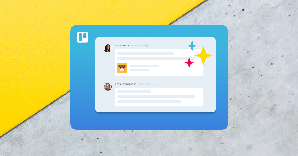
Inline images are now rendered in comments
TIP SendBoard automatically detects which images are important and promotes them to card attachments – but you can change how the Power-Up handles inline images. Have a look at our help center for more information.
Enhancing your Email for Trello experience
Our new features aim to make email in Trello more efficient – and more visually consistent with Trello’s latest UI updates. Take a look and let us know what you think! We hope these small enhancements make a big improvement to your email experience.


